
Brown & Haley, commonly known as ROCA®, is a confection manufacturing company located in Tacoma, Washington. They have been in business since 1912. Their sweet creations, including the world-famous ALMOND ROCA® and MOUNTAIN® Bar, are distributed and sold in over 63 countries. Their competitors are Ghirardelli® and Ferrero Rocher®.
| Role | Time | Tools |
|---|---|---|
| Website Redesign Website Graphics Photo Editing Ux/UI Design |
2018 - Present | Adobe Photoshop Adobe Illustrator Squarespace |
Much of Brown & Haley’s sales are currently conducted through brick-and-mortar locations. Brown & Haley® wanted to redesign their website to build their online customer base and increase revenue from their online store.
In the fall of 2018, I took over the Brown & Haley® website redesign. This project had been in the works since the spring of that same year. The company had made the decision to privately manage their website and chose Squarespace as their content management system.
When I inherited this project, the template and the navigational framework had been established. My role was to continue to add content to the site, including promotional graphics and packaging images.

Many of Brown & Haley website visitors are Baby Boomers, who are familiar with the ROCA® brand as well as the product. They visit the site to order products for themselves as well as gifts for others. They prefer a desktop online shopping experience over using a mobile device. These customers may find the Brown & Haley site via a digital marketing search.

The Brown & Haley website also serves B2B customers who visit the website to obtain sales aids such as product images, catalogs, brochures.
Competitor websites were researched. Through this research, I found that the competitor websites were more graphic and engaging, and product descriptions were easy to scan.
A usability test was conducted. The usability test objectives were to determine inconsistencies and identify problem areas within the website. Users were observed to understand any obstacles in navigating the website. Each participant was asked to go through a list of set tasks. The number of user errors was calculated as well as task completion rates.

If the homepage was more engaging and optimized for search engines, customers are more likely to find our website and revisit it in the future.
To improve the homepage, I added seasonal images and special promotions to the hero carousel and included a section for featured items.
The homepage also features a holiday section where seasonal images can be switched out regularly.
I included recipes to grab the user’s attention and give them a reason to come back to the website. All of the recipes on our website include Brown & Haley® products.
Additionally, there are links to the store locations, Brown & Haley history page, and social media.
Quick links were added to the bottom of the page for easy access to key information including links to the B2B pages.
If the product page was better organized, and product descriptions were concise and informative, consumers would be more likely to purchase online.
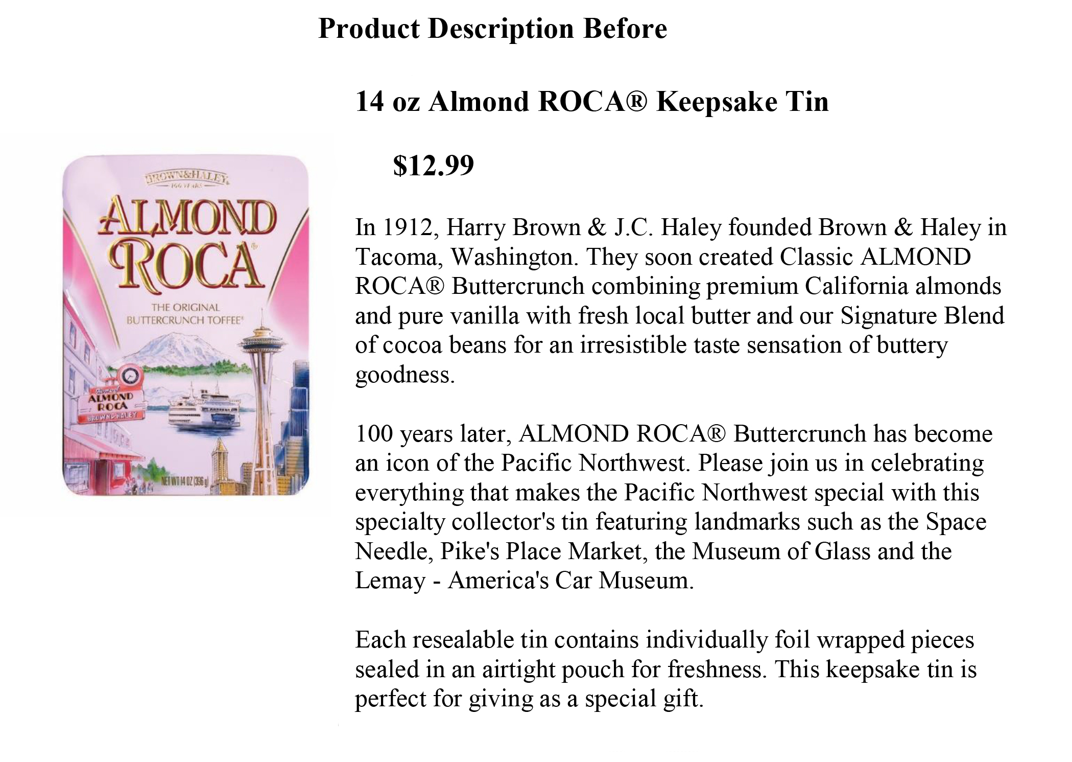
To improve the product pages, I made the information more concise. I added bullet points for easy scannability and included the weight and dimensions of the product.


If If customers were encouraged to return to the website, we could sell more products online.
I designed thank you cards with a 15% discount off a future online order. These cards were included in every online order shipment.
Through user testing, I found that the improvements to the site made it easier to navigate. One of the UI test participants said he ”...loved the website, and taking the test made him hungry for chocolate”.
Data collected indicates that online sales have increased 34% from December 2019 through December 2020.
ROCA® is also available in brick-and-mortar stores across the country and around the world. Consequently, I recommend a store locator page be added to the website to accommodate site visitors who are looking to buy locally.
Other website improvements are in the process of completion including responsive page redesigns for the following pages: ROCA® Masters, MOUNTAIN® Bar History, and ROCA® Around the World.